What if there was a banking solution designed by Apple? Would all the other digital financial solutions be forced out of business? There are rumors about what would happen if Google, Apple, Facebook or Amazon (also referred to as GAFA) decided to
enter the world of banking. My team decided to put this idea into action and dare to use UX design methodology in order to create something never before seen. Who said a financial design has to be a pain, rather than something simple, beautiful and, most importantly,
pleasant to use?
Why it’s worth to read this:
I am inviting you to join me on a journey that will show you a totally different way of developing financial services design. Our team dared ourselves to try UX design approach in creating the simplest, most beautiful and delightful banking UI experience
in the world while maintaining the full-scale digital banking functionality at the same time. This process does not pretend to be an ideal banking solution, but aims to demonstrate an alternative method of human-centered financial design in order to inspire
change.
What if you wanted your customers to be more than just users? What if you wanted to make them fans of your financial service, just the way Apple does? If you did so, you would gain their loyalty and support in return. To achieve that, you should get to know
them better and look at the world through their eyes. Every individual has his own unique view of life, but all of them have something in common─it's human nature.
By going through this exact process we got the following banking design, and further, I will show step-by-step how similar results can be achieved:
Video: Mobile Banking App Motion Design
The step-by-step guide to delightful banking design
First of all, you need to analyze the business goals of the new product. Identify the business model and the product launch strategy to better understand how to maximize the banking service value for the user.
Collect as much data as possible about your target user base. It is important to uncover the needs and feelings of those who might become passionate about the service.
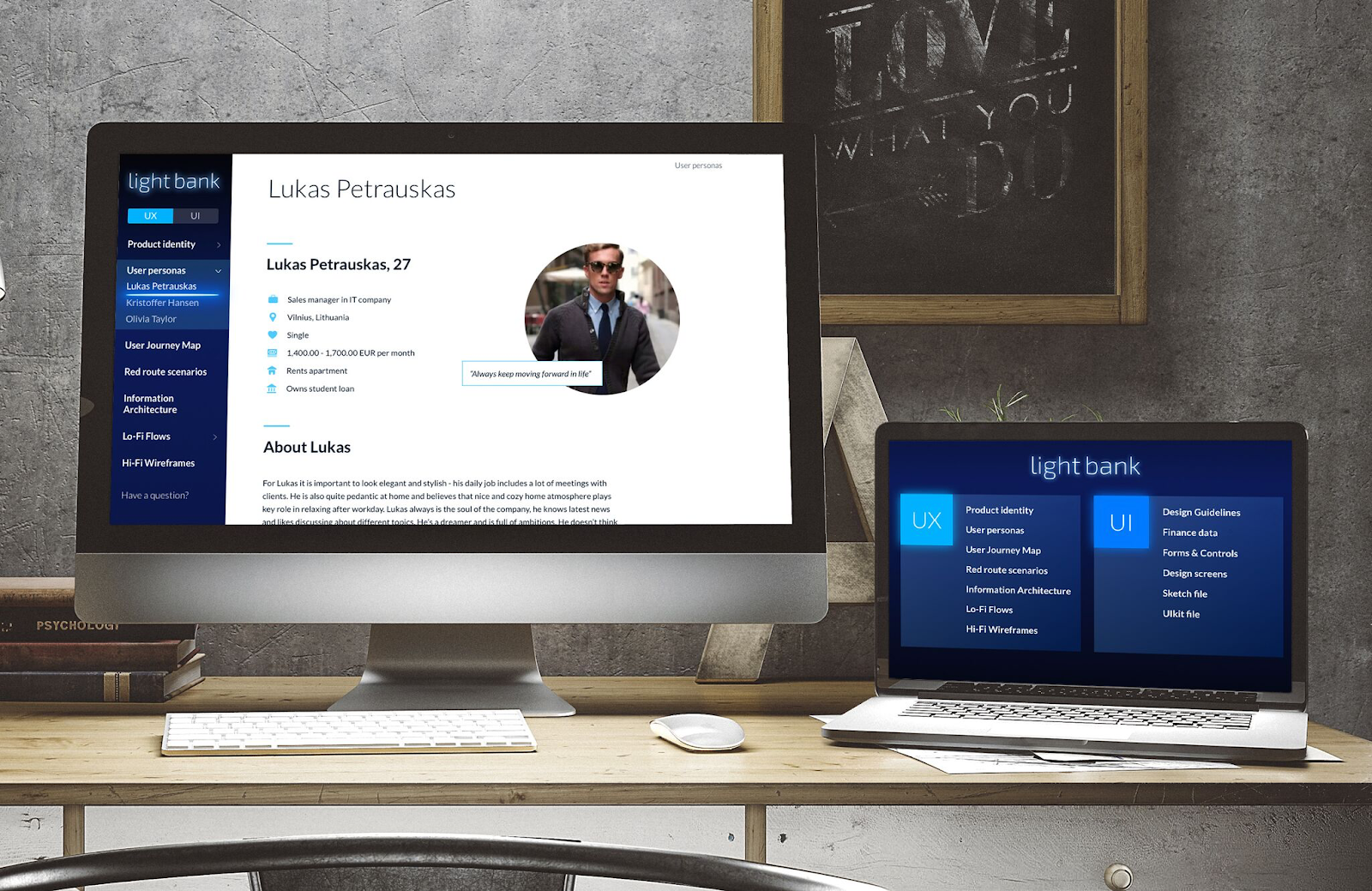
1. Step: Key Personas
In our case, after conducting many interviews, gathering publicly available information and organizing individual questionnaires on social networks, we formed several potential user profiles for our digital banking service. The heroes of our story were a
millennial student, an entrepreneur and a businesswoman.

Our heroes were mainly characterized as:
-
Early innovators: active people who follow the latest trends and find traditional banking apps complex and boring.
-
Beauty admirers: they appreciate appealing products and the latest innovations to ensure a future-oriented lifestyle.
It followed that our mobile banking app user interface had to include the following features:
-
Mind-blowing
-
Emotionally engaging
-
Delightful
-
Deadly simple
-
Innovative
To summarize, our banking design had to be innovative and visually appealing to stand out among the best of the FinTech applications available in the marketplace.
2. Step: Empathy Map
We created an Empathy Map for each person and summarized the key financial service usage scenarios according to their priorities. This allowed us to look deeper into the experience of our characters and to see the world through their eyes.

Empathy Map should indicate a pain points and concerns regarding experiences gleaned from other services. In our case their main concern involved the complexity of the digital banking service and its dreadful, outdated design. In order to turn this around
and provide a pleasant user experience, we had to get to know our customers better and try to look at the design from their perspective.
Our users were particularly interested in non-banking FinTech applications as they were often invited to try them out by friends who had already explored what these financial products can offer.
3. Step: User Journey Map
In this step, we combined all the collected knowledge using a User Journey Map (UJM) technique. We combined UJM methodology with bUP (Business, User, Product) frame suited for digital financial service development.
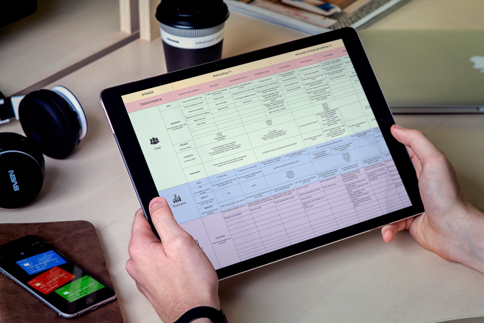
Our user experience engineer’s task was to understand the big picture of users’ expectations, emotions and scenarios together with business goals, Key Performance Indicators (KPIs) and strategy. Understanding the big picture allowed us to engineer a stage-by-stage
banking app user experience that would meet the needs of both the customers and the business in the best way possible.
At this milestone, we clearly identified the most critical touch points from an emotional point of view. It is proven users remember service experiences that made them feel bad, and it is challenging to reverse those feelings through positive experiences.
Taking this into account, we found key pain points that had to be addressed in order to provide the ultimate digital banking experience.
The Journey Map for our mobile banking app consists of 5 stages, 17 touch points and 346 statements. The number of touch points for more complex financial services that UX design can reach 100, and the total number of statements can exceed 2,000. Let's look
at an example to understand how the User Journey Map works.
The goal of a touchpoint “Add funds to account” was to quickly and safely top-up the Light Bank account from any other money account. Therefore, the touchpoint's scenarios include:
-
Top-up account from new bank account/card
-
Top-up account from saved card
-
Top-up account from ApplePay
-
Top-up account from PayPal
During these scenarios, the user might feel impatient and excited. At the same time, he/she might have questions such as:
-
How can I add money to my banking account?
-
What details do I need to provide?
-
Is it safe?
-
How much time does it take?
One of the user's pain points at this step could be having to repeatedly enter payment details when performing the top-up function to add money to his/her Light Bank account at any time.
From the business point of view, the most important goals of this touchpoint could be the frequency of top-ups and amount of money being topped up by the users.
KPIs could be measured by:
-
the percentage of successful and unsuccessful money transactions
-
average time spent to make a top-up transaction
-
average amount of transactions.
At the same time, it is important for business that the user perceives the top-up process as innovative, easy, clear, fast and secure. In this stage, the banking app can position this benefit as “account top-up in seconds.”
By trying to understand users and business, we discovered what's required from the mobile banking app at each step of a user’s interaction. This allowed us to make a list of functional requirements, develop a Red Route Map Analysis and identify the “power”
user scenarios.
4. Step: Information Architecture
At this step you need to create the Information Architecture of the banking app design, that would take into account the mental models of users to convey to them the structure and principle of operations in the most simple way.
After creating the Information Architecture, we were able to learn everything about the conceptual service model that is built from basic information blocks, including a thesaurus. For this task, we used the “Card Sorting” method, in which potential users
are asked to group the service elements according to their specific perceptions.

In our case, we simplified the structure of the service so that we could remove the navigation menu. Despite this, we kept all the basic banking functionality needed for our users. The service has full information about the users’ accounts and transactions,
including statistical charts. Users can send money, request money, top-up the account and schedule recurring payments. It is also possible to add and manage numerous financial products, including loans, insurance, cards, investments, etc. And, of course, the
service still has profile settings, notifications and support.
5. Step: User Flows
After learning about user scenarios and developing an Information Architecture, we built the base of our UX strategy. Now, we were able to proceed with Low-Fidelity (Lo-Fi) User Flow development.
Lo-Fi flows should be created to understand the correct sequence of the main user scenarios, which have been identified in the previous steps. It helps to design and adapt actions that users have to make in order to achieve their goals.

With Lo-Fi flows, we were able to build the internal logic of the mobile banking service by considering all of the functional requirements of the digital banking application.
We need Lo-Fi flows for checking UX conflicts in the main user scenarios, and, usually, during the process of project development, Lo-Fi maps are adjusted.
For this concept, we developed 35 basic User Flows.
6. Step: Wireframes
In next step, we proceeded to the development of a High-Fidelity (Hi-Fi) wireframe. Our task was to visualize the screen structure and content, considering the logic of the service and all of the previously generated UX insights.
The use of such “visual language” allowed us to develop the banking app by putting the primary focus on the perception of the user, rather than using a traditional technical requirements list that can be misread and is far from the reality of how users perceive
FinTech services.

We use Hi-Fi wireframes to create mobile banking app prototypes for testing the main vision and the key user scenarios from the Red Route Analysis.
Despite the fact that we had simplified the architecture and interactions of the banking application as much as possible, the total number of wireframes required to work on the concept exceeded 100.
Our main goal from the user testing was to identify spots in which users found it difficult to cope with the given tasks and where they did not understand the interface in the concept. As a result, we made the necessary corrections to “bottlenecks” or found
alternative solutions.
For example, some difficulties occurred when users tried to understand how to activate the payment function. In this case, to keep the simple architecture of the mobile app, we were not able to remove this interaction. Instead, to provide clarity for users
who were not tech savvy, we included a learning tip that would be displayed at the first login.
7. Step: Mood Board
After discussing test results with the team of UX specialists and making the necessary adjustments, we proceeded with the key concept of our mobile banking design. The UXDA designers’ team carefully explored UX strategy, description of the main users, the
business requirements, UJM and the product vision. With the UX deliverables in mind, our UI designers composed a mood board for the service.

When developing this concept, we focused on the human perception as much as possible.
It is no secret that we, as humans, have a desire for beauty. And, as many will agree, one of the greatest beauties is Mother Nature. Crackling fire... bubbling waterfall in the middle of a forest... a peaceful night sky full of stars... Nature has hypnotized
us with her simple beauty since childhood, because it is embedded in the evolution of our brains.
One of our main goals was to translate this feeling of euphoria from the touching miracle of nature. It was a big challenge for our team to design Light Bank that, at the end of the day, should fascinate and delight users so much that their daily financial
operations would seem to be a completely different reality.
8. Step: Key Design
Creation of the Key Design Concept is the most significant milestone in user experience engineering. The main task of this stage is to find a way to transform emotions and ideas into a product that millions of people would love to use.
To perform this task, it is not enough to add colors to the wireframes or follow abstract design inspiration. The only way to design the ideal solution is by taking into account the following points:
-
UX requirements
-
Features of the digital platform
-
Principles of interface design
-
Psychology of visual perception
-
Current UI trends
-
Technical capabilities of the system
-
Typology of UI elements
-
Ability to scale the concept into a high-grade Design System.
Typically, the entire design team, under the Art Director's leadership, participates in the design concept development. Brainstorming, benchmarking and testing of a large number of solutions and UI elements are undertaken to find the right design solution.
During this process, which can last for a week or more, the initial design goes through a number of transformations and becomes altered. The process continues until the ultimate results are achieved, which inspires the entire team and meets all of the intended
requirements.

Proof of concept
For this case, our ultimate task was to create a design concept showing the implementation of UX design approach and of the most important and basic user scenarios. In total, 30 screens were created, which were then combined into a clickable InVision prototype
and motion design.
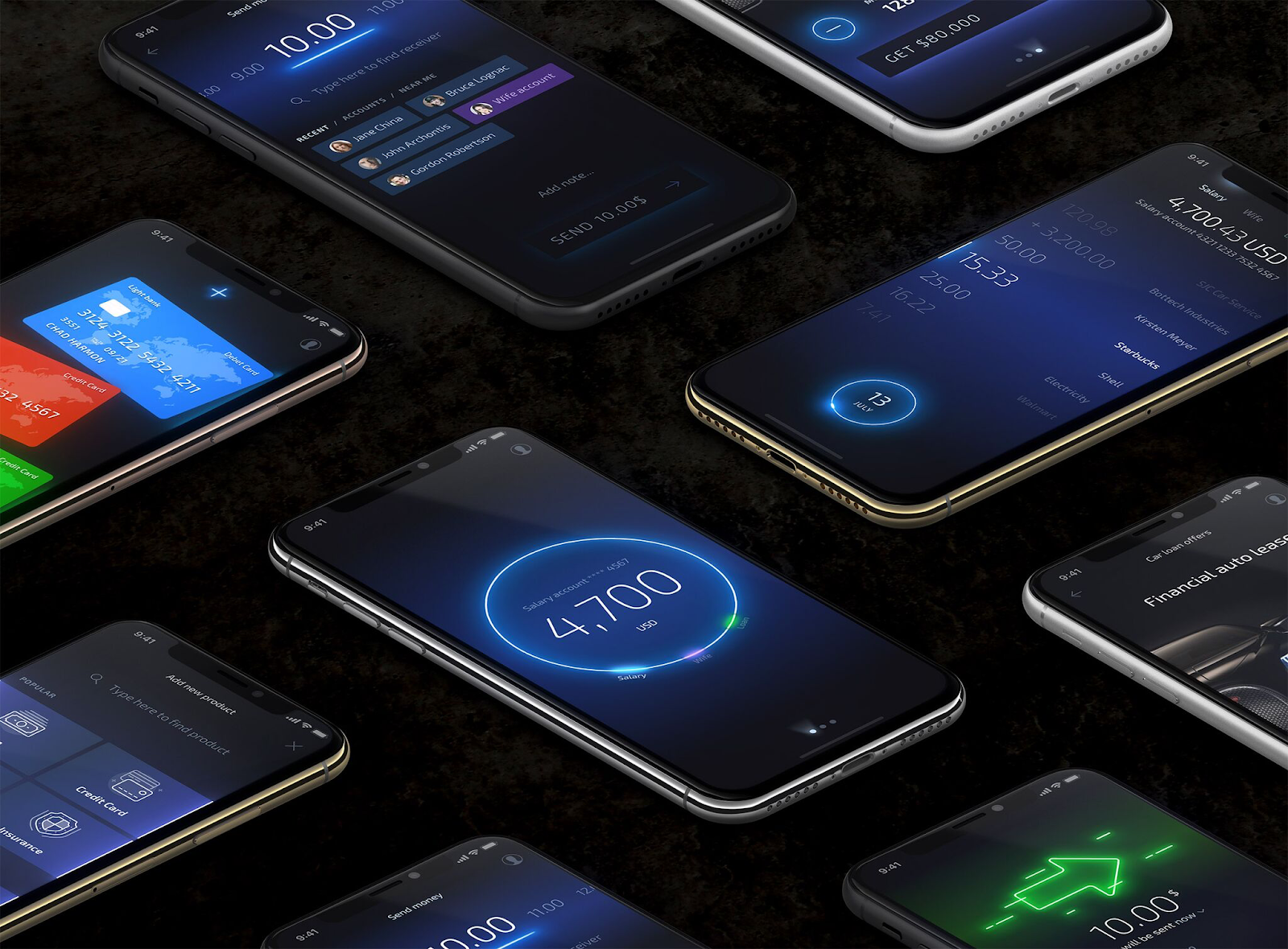
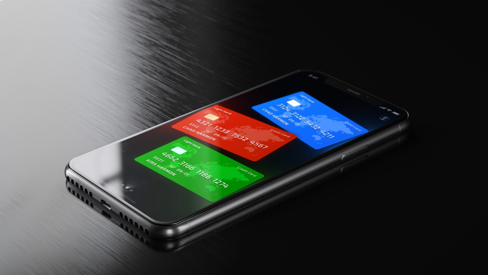
Endless accounts
Our journey starts by entering Light Bank using a Face ID verification. Then, we see the balance of our primary account, and we can swipe to view the balance of other accounts.

After accounts screens, we see the list of our credit cards, followed by the marketplace where we can apply for any financial product. The list of accounts is unlimited and can show accounts from different banks, as well as different financial products such
as loans, insurance or investments.
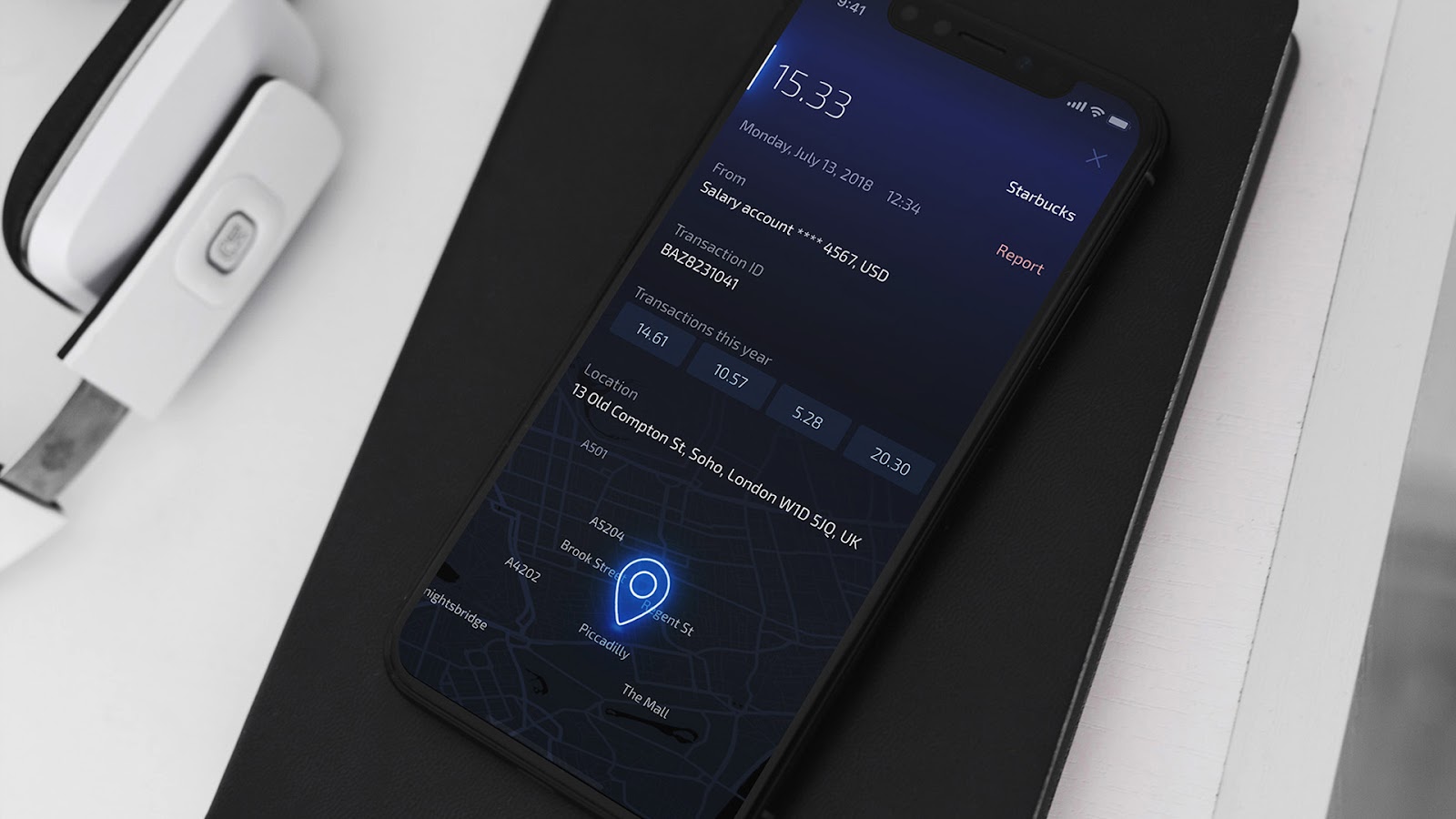
Transparent transactions
We can open the transactions history simply by clicking on the account. On this screen, we see only the basic information of each transaction─the amount and the beneficiary. While scrolling through the transactions, we will get to the bottom of the screen
where there is a date, which also has the filter functionality. By tapping on it, users can specify the time period for transactions or sort all transactions according to their desired parameters.

Users can see detailed information about the transaction simply by tapping on it, features such as time, ID number, address and even previous transactions to the same beneficiary.
Useful Details
For most users of mobile banking apps, it is critical to be able to view their balance and transaction history. For some users, it is also important to be able to view a detailed analysis of how their funds are performing. To this end, we created a statistics
chart, forecast and settings section, which can be opened simply by tapping on the balance amount. The user can select the type of data he/she is interested in, along with the date range. In the details and settings section, the user can view the technical
details of the account and will have the ability to change the limits.

Rich opportunities
In the Light Bank marketplace, users have a wide range of financial products at their disposal. Customers have to choose the type of product from the list, as well as its purpose. In this example, we choose a loan with the purpose to purchase a car, and
Light Bank will quickly display three pre-approved offers to us.
The leasing offer is customized to the specific user, based on their financial profile analysis. The customer can then view the maximum leasing amount, which can be edited by reducing it. He/she can also recalculate the leasing by changing the monthly payment
or the total amount.

Instant payments
To open the money transactions menu, we simply tap and hold the balance amount on the main screen. Two categories of actions then appear─Add Money and Send Money. The function Add Money allows us to top-up the chosen account using another bank's payment
card, split the bill with friends, share our account details to request money or generate a voucher PIN so our friend can deposit remotely through an ATM.
Our UX architects and UI designers created the Send Money function to be as simple as possible for most scenarios. In most cases, all we have to do is to enter the amount and beneficiary name. The majority of all transfers are to the same recipients, so
we created a Recent list in which users can easily find their favorite transaction recipients.
Customers will also appreciate the Search function. Smart search will offer a list of possible beneficiaries from the contact list, bank templates and transaction history. It is also possible to conveniently send money using the function of geo-search, which
locates friends who are nearby and also connected to Light Bank.
In case users can't find what they are looking for in the search bar, a New payment feature will automatically appear. To transfer between accounts, all the user has to do is simply select the Accounts tab.
On the payment confirmation screen, the user has the opportunity to postpone the payment by changing the date of execution, as well as the ability to set any payment as recurring.

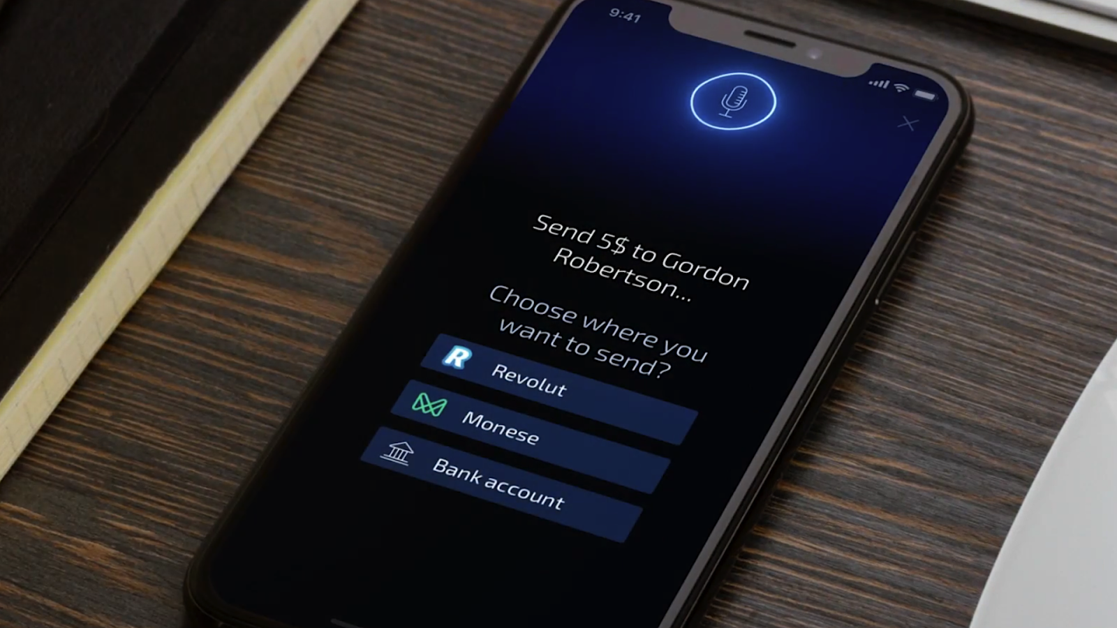
Careful assistant
The Light Bank also offers the use of a banking voice assistant. All you have to do is say “Hi, Light Bank!” and a voice chat with the bank will open. You simply need to indicate the beneficiary and amount, and the payment will be prepared.
Suppose that when loading the contact book into Light Bank, through the open banking API, you have found that your beneficiary has several accounts in different banks. In this case, the user has the ability to choose the specific account to which to transfer
money.
Attractive notifications
Of course, we thought a lot about notifications. Wouldn't it be nice if, instead of boring pieces of text, we could add some emotions and make them visual and animated? By doing this, we would not only attract the attention of users, but also increase the
involvement in the mobile banking app by offering a more enjoyable and interesting experience.

Customized appearance
Light Bank could not be called Light Bank if it didn't follow the natural course of daylight changing into a night light. You could almost call it alive. Using geo-data and timing, Light Bank automatically makes the transition from a lighter to a darker
background according to the time of the day. If a user prefers one particular background, he/she can choose to set it as default and use it all the time.

Financial Design System
Finally, you need to ensure your design concept with a potential for further development and scaling. This can be done by creating the Design System. It is like a library that unites UX deliverables, UI assets, commonly used visual components, design principles
and style guides for the specific product. The system helps to build bridges between the product developers and the stakeholders.
Advantages for the customers: using the same design language for the complex interface, or even different digital channel products, results in service consistency and the reduction of cognitive load for the users.
Benefits for the business: even if the teams are located in different areas around the world, when everyone is “on the same page” and speaks the same language, designs are more robust and collaboration is faster and much more effective. Design System
assists the development team to quickly scale its ever-growing client needs.
Gains for the designers: it is more convenient to break down user interfaces one by one, rather than working with all of the screens simultaneously. This allows the designers to easily define and change the components in order to make them “pixel perfect.”
And, for the developers: the Design System can be used to build an associated element code library and use similar copy/pasting constructs for ease of development.
The Financial Design System provides a convenient and quick way of finding elements and achieving fast interface prototyping without the need to search for specific elements or modules in hundreds of screens. This significantly boosts the speed of creating
and assimilating a unique product design language by the design and development teams.
Afterword
This is UX design journey to the simplest and most beautiful banking design app, as we see it. I published this concept in order to inspire change. Our aim was to illustrate the increase in value that a human-centered design can bring to the digital banking
service development. All it takes is “out of the box” design thinking, an open mind and a genuine determination to untangle the world of finance, placing the focus on a pleasant user experience.
I encourage you to go one step further beyond average and create the best financial solutions that your customers are seeking. I hope you can use this UX design case study as a guide to get there.
Check out my blog about financial and banking UX design >>